Emma Berliner is a director, motion designer, creative director and educator based in Los Angeles, CA.
Her collaborative interdisciplinary practice specializes in visual identity and motion design for screens, big and small.
Past clients include Herman Miller, Nike, Glossier, Footlocker, Luna Luna, HBOMax, Netflix, Coca-Cola, Crown Royal, Vogue, Goop, CalArts, Annapurna Pictures and Paramount TV.
In addition to her design work, Emma teaches motion graphics & graphic design at CalArts, CalState Long Beach and the California College of the Arts.
Her interests include dogs & disco.
Please feel free to reach out directly with questions or to request a PDF portfolio for additional work samples.
Vimeo
Contact
©2025
new site in the works :) very soon
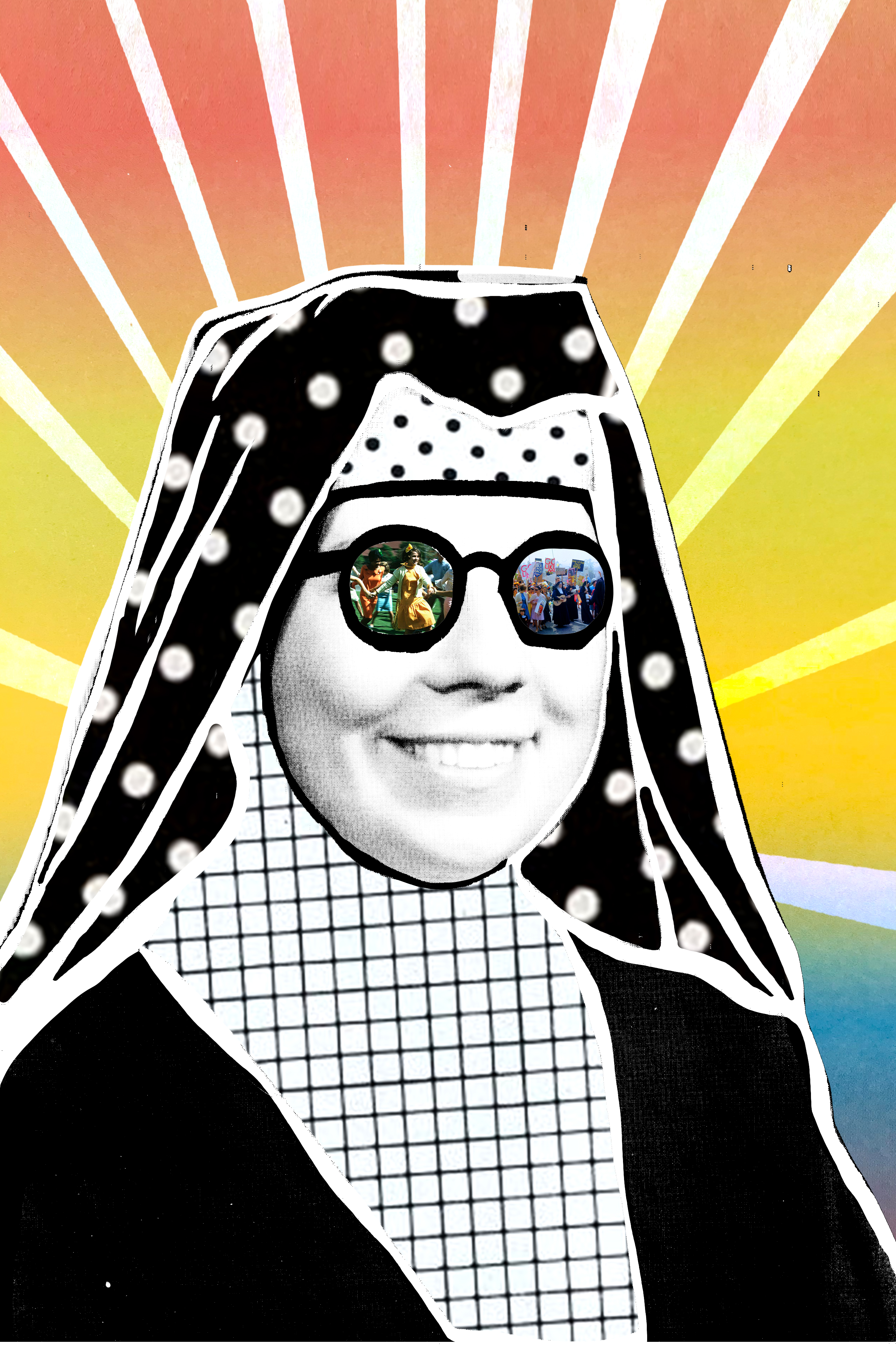
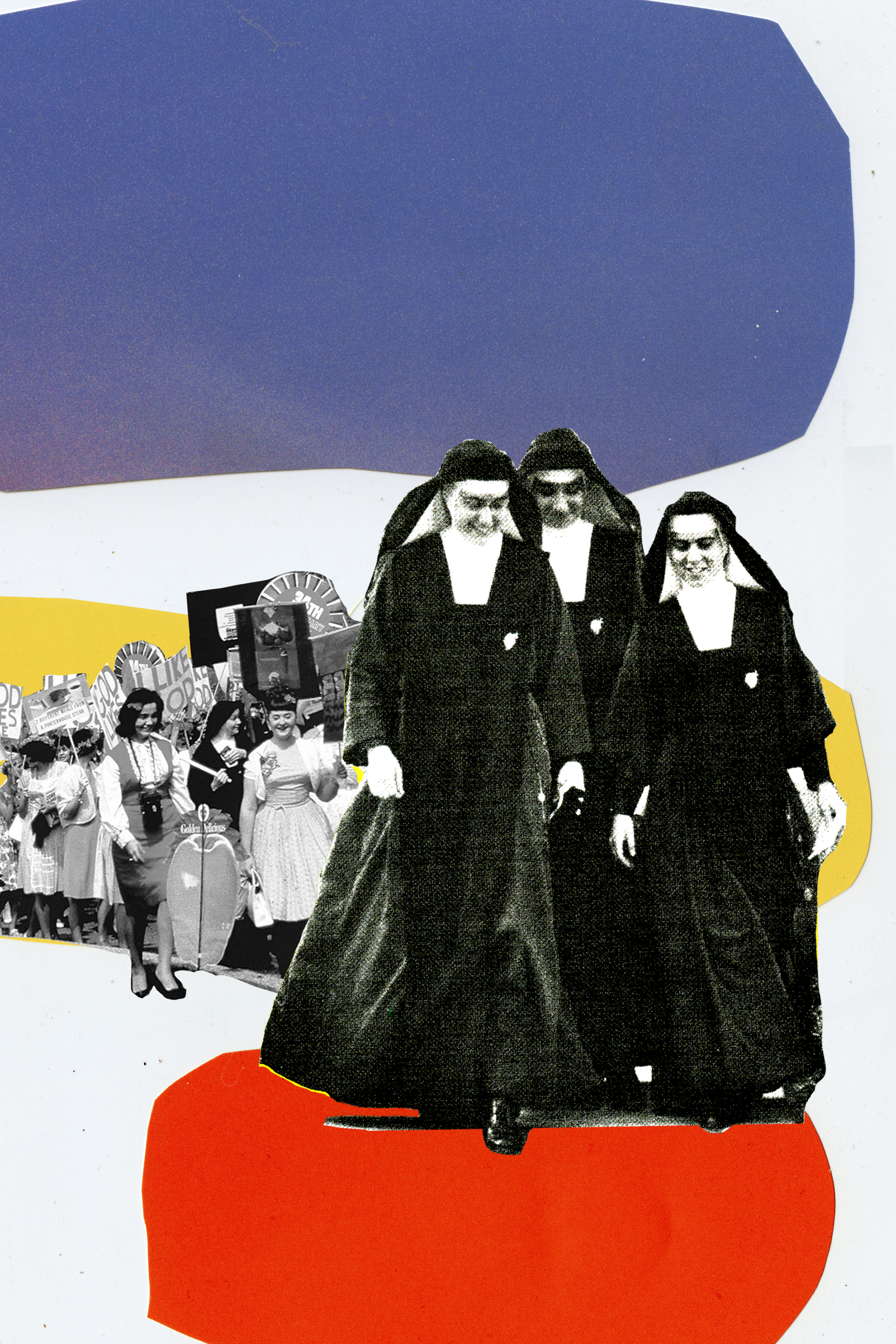
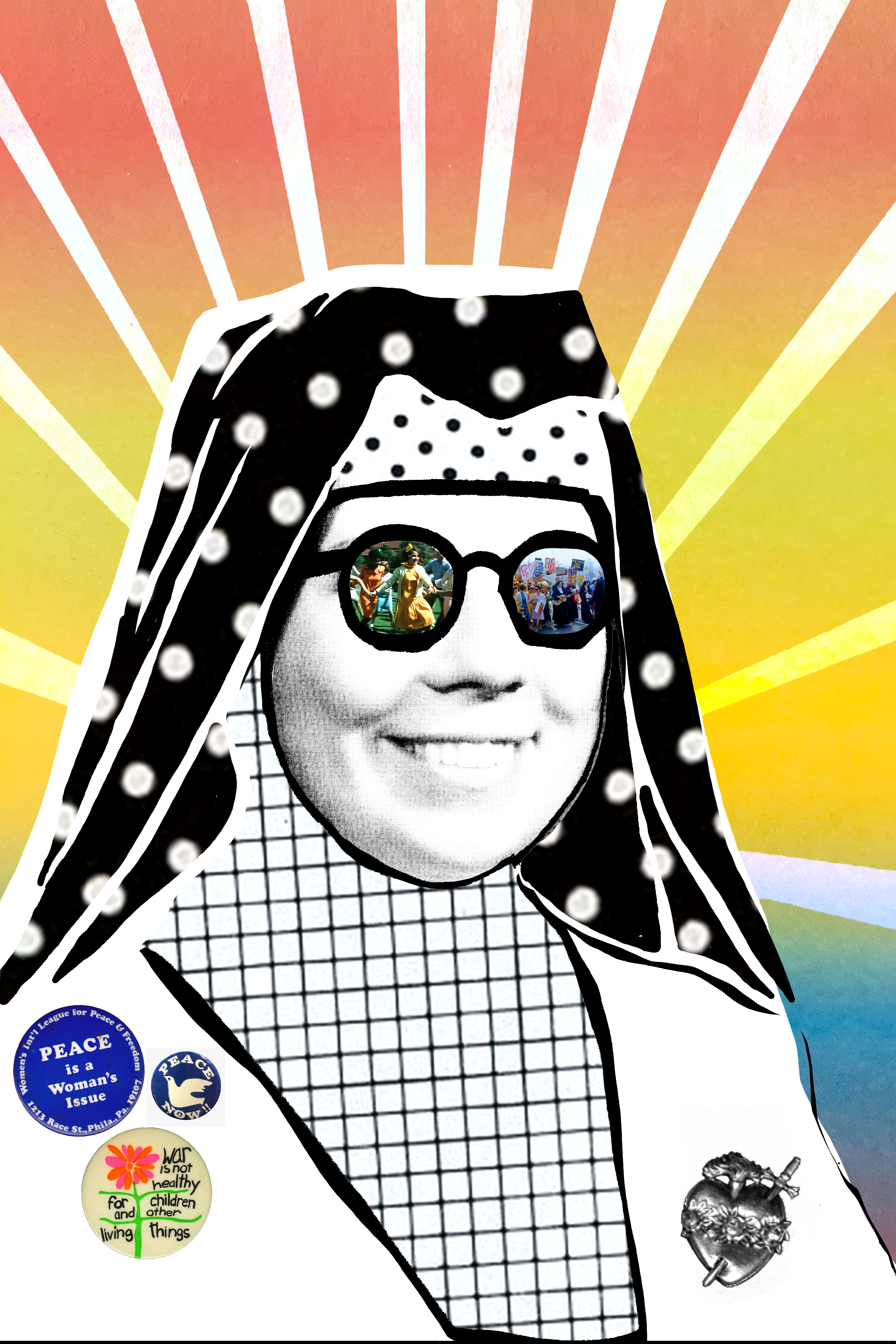
Rebel Hearts
GRAPHIC DESIGN, ILLUSTRATION & MOTION GRAPHICS
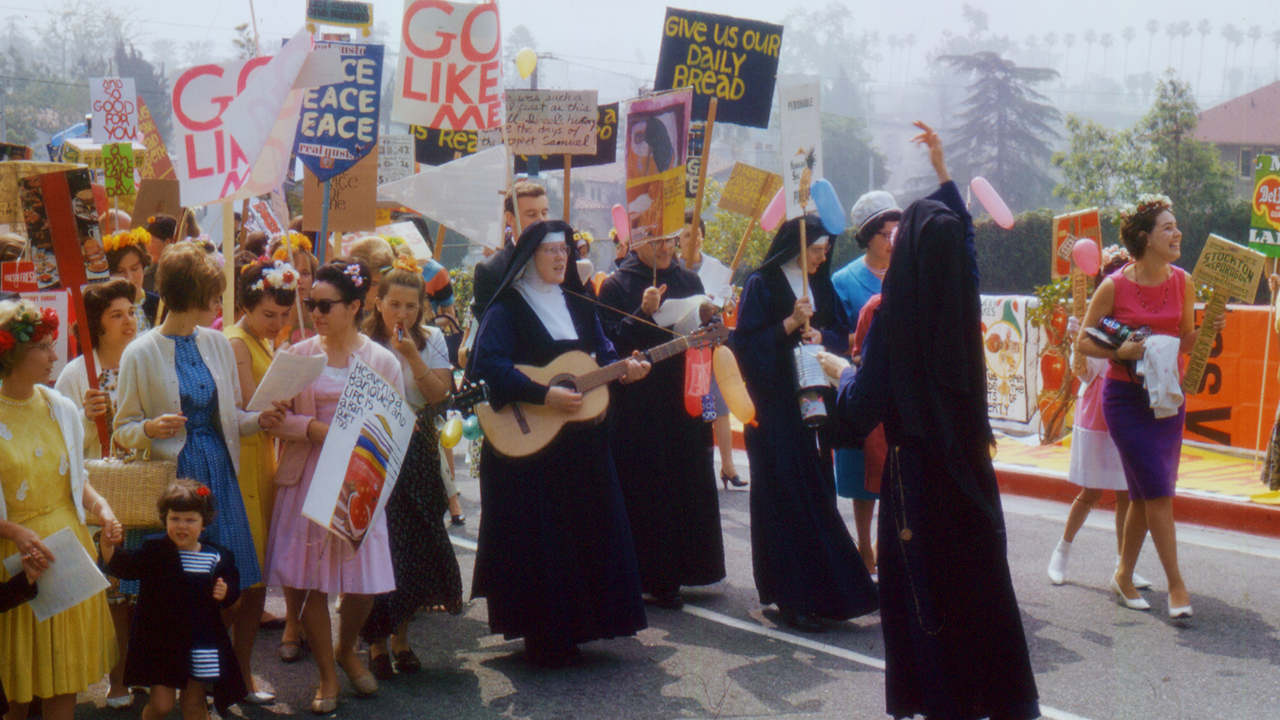
In 1960’s Hollywood, the Sisters of Immaculate Heart, a trailblazing group of nuns, bravely stood up to the patriarchy of the Catholic Church; their bold acts of faith, defiance and activism turned the Church upside down, helping to reshape the role of women in contemporary Christinanity.
The visual design of the film looked to the rich, graphic legacy of iconic pop-artist, Sister Corita Kent, one of the Immaculate Heart sisters and chair of the Art Deptartment at the Immaculate Heart College. Blending Corita-inspired pop graphics with archival elements, we created motion graphic collages that spoke to the radical nature of these rebellious sisters.
CREDITS
:
Discovery+
Director: Pedro Kos
Producer: Judy Korin
Editor: Erin Barnett, Yaniv Elani
Animation: Una Lorenzen
Motion Graphics: Emma Berliner, Juan Delcan, Spencer Haley, Daniel Claridge, Olivia Sebeski, and Hanbi Sung
Key Art Design: Emma Berliner
:
Discovery+
Director: Pedro Kos
Producer: Judy Korin
Editor: Erin Barnett, Yaniv Elani
Animation: Una Lorenzen
Motion Graphics: Emma Berliner, Juan Delcan, Spencer Haley, Daniel Claridge, Olivia Sebeski, and Hanbi Sung
Key Art Design: Emma Berliner
MAIN TITLE DESIGN
(Main Title concept, design and animation by Emma Berliner & Juan Delcan)
My role as the motion designer began during the creation of the initial sizzle reel – working closely with Director, Pedro Kos, and Producer, Judy Korin, to establish the overarching graphic look of the film at an early stage. Once the film secured financing, I worked closely with animator Una Lorenzen, to marry the graphic language with character animations her team were creating. Throughout the edit process, I animated multiple graphic sequences which appeared in the final film. The culmination of this work was designing the film’s opening title sequence – a synthesis of the graphic and motion language to convey the narrative tone.
MOTION GRAPHICS
(Selection of two scenes that I animated within the film)
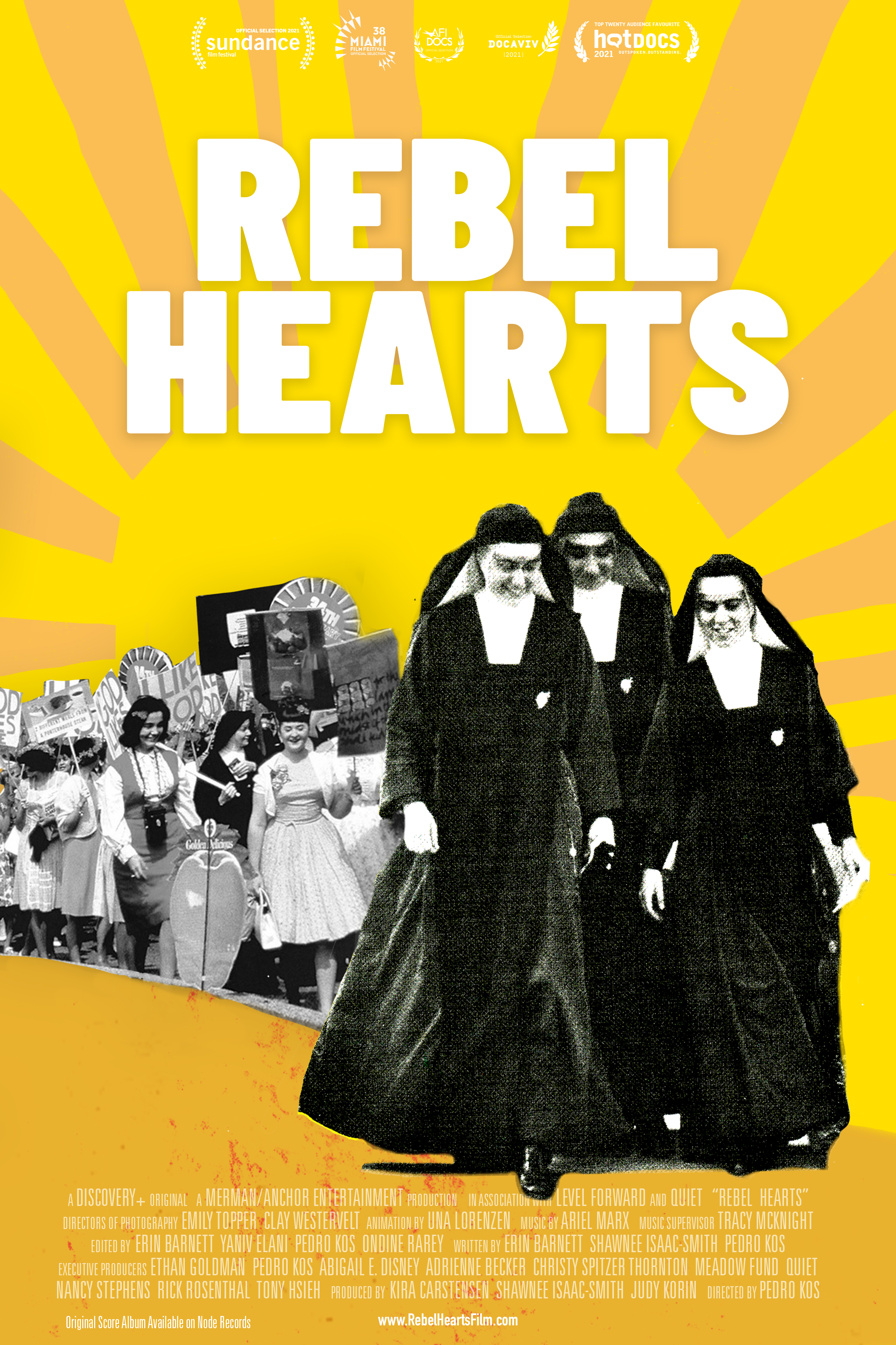
KEY ART
The film’s key art captures the feeling of the sixties: mixing bright, saturated elements borrowed from pop art with the ripped paper and tactile immediacy of social justice graphics.
A variety of
sources provided inspiration for the film’s key art, including: Milton Glaser’s iconic Bob Dylan poster, The
Irregular Bulletin, a publication designed and produced at Immaculate
Heart College Art Department, Psychedelic Posters spawned from
California’s rock concert scene and the Protest Art of the 1960s social
movements.
The Final Theatrical Poster
SKETCHES